By: Rebecca Monteleone
Hello, friends and readers! First, let me apologize for how
long it has taken me to post this, [insert appropriate excuse for my poor time
management skills]. Life, man.
Today, I want to branch out a little bit and talk about
something that each of you encounters nearly every day. This topic is something
that is becoming more and more integrated into our daily lives so that its
ubiquitousness makes it nearly invisible. While its pervasiveness is excellent
in some ways, its pedestrian status may cause us to undervalue it. And worse,
assume that it is maximally effective and there is nothing to be done. Readers
here at [Insert Disability Euphemism Here] know that there is always something to be done. Always.
So what am I talking about?
UNIVERSAL DESIGN.
The History
Universal Design is a term coined in the late 1950s by
architect Ronald L. Mace, which he defined as, “The design of products and
environments to be usable by all people, to the greatest extent possible, without
the need for adaptation or specialised design.” [Source]
Universal Design (or UD, as people who love acronyms refer
to it) is the idea that community and commercial spaces and products should be accessible
by their nature. UD is not about adjusting spaces for a specific group of
people (i.e. people with disabilities), but about making all spaces and
products welcoming to all people. Places and products should be available to a
wide range of people by their nature.
It seems almost too obvious, doesn’t it?
Think about it this way, there's no need to pay to install a
ramp (which, just for the record, is required by law, folks) if you design your
space to be accessible from the get-go. This also enables the architects to
better control the aesthetics—accessibility can be beautiful.
 |
| Robson Square, Vancouver Canada Photo by Dean Douchard |
While Ronald L. Mace was the first to use the term Universal Design, the real champion of the movement was UK architect Selwyn Goldsmith. In 1963, his book Designing for the Disabled, provided the first guide for architects hoping to create accessible spaces. Prior to his work, architects and building planners had no basis for creating welcoming spaces. Their ignorance to the needs of people with disabilities did (and still does) systematically exclude people from participating in their communities.
Goldsmith, who himself was a wheelchair user, interviewed countless people with disabilities while conducting research, practice that was nearly unheard of in the 1960s. The direct result of his first batch of interviews was the magnificent and truly innovative ramped curb!
 |
| Look at it. LOOK AT IT. (FUN FACT: Truncated domes [tactile paving] were developed by Seiichi Miyake in 1965 in Japan for the benefit of people with visual impairments, but would not be introduced in North America or the UK until the 1990s) (Source) |
Despite his contributions to accessibility and inclusion, Goldsmith
did not consider himself a disability rights activist, and in fact, steered
wide of any kind of political affiliation. At one point in his career, he was
invited onto a local council in an effort to fill their disability quota—an
offer he vehemently refused on the grounds that the his disability was not to
be politicised. (Read more about Selwyn Goldsmith’s life here)
At the end of his career,
Goldsmith took a radical stance on creating inclusive spaces, stating in his
final book Universal Design that having what would be considered extreme or complex needs is
not aberrant. It is the most normal human condition.
Examples of UD
 |
| Roll-under sinks in public restrooms |
 |
| Rocker light switch |
 |
| Types of accessible door knobs |
The previous two examples are particularly relevant for
people without full dexterity in their hands or fingers. What makes UD
important, however, is that these architectural components are useful for
typical individuals as well. Ever been carrying a load of groceries and been
unable to open the door or flip the switch? Universal design is good for all of
us.
 |
| Accessible pedestrian sign |
The traffic signal pictured above provides both visual and
auditory information. What strikes me about it, additionally, is the simple
symbols that provide step-by-step instructions for its use. Individuals with
dementia, intellectual disabilities, or literacy issues will be able to utilise
this crossing which in turn empowers independence and community involvement.
Providing information in a variety of ways (sound, symbols, text, etc) vastly
increases the number of people who are able to use the product or space.
 |
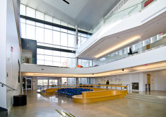
| Gallaudet University |
Here is an image of Gallaudet University, the United States’
only university for the Deaf. The architecture is deliberate, maximising open
spaces and clear lines of sight so that signers can communicate across and
between floors.
 |
| [Soft Clothing] |
Soft Clothing is a sensory-friendly children’s clothing line.
“Flat seaming, printed labels, soft fabrics, and seamless features” make their
clothing comfortable for children with sensory-processing differences. The line
is available through major clothing dealers around the world, and their website
can be found here.
- Equitable Use:
UD should strive to provide identical means of use for all users and
not segregate users with more complex needs. For example, forcing a person with
mobility issues to use a service elevator directly violates this principle.
- Flexibility in Use:
There should be choice in how a
user utilizes a space or product, and adaptability should be inherent in the
feature. Something as simple as left or right-handed railings illustrates this
principle.
- Simple and Intuitive Use:
The most salient message of this
principle is that all features should accommodate a wide range of literacy and language skills.
- Perceptible Information:
Building on the previous
principle, the design should use multiple modes of delivery (symbolic, tactile,
auditory) to ensure that all users can understand information.
- Tolerance of Error
The feature should minimise hazards
and provide fail-safe features in the event that users incorrectly utilise the
design feature.
- Low Physical Effort
- Size and Space for Approach and Use
What about Virtual Universal Design?
Good question, reader! It’s like I’m having a conversation
with myself! There has recently been a push to ensure that technology is
accessible to a wide range of individuals (with varying degrees of success).
The Web Content
Accessibility Guidelines 2.0, published by the World Wide Web Consortium
(W3C), published in 2008, currently stand as the most widely used and accepted
guidelines for online accessibility. It is broken into four sections:
- Perceivable: providing alternative formatting and presenting content in multiple ways
- Operable: providing users to navigate content in the easiest way for them (include keyboard functionality, extended timers, etc)
- Understandable: making readable content, and producing methods for avoiding and correcting errors
- Robust: Compatible with current and future technologies, including assistive technologies (screen readers, etc)
FUN FACT: There are several free programs available online
to check how well your webpage is adhering to these accessibility guidelines.
My personal favourite (yes, I do have a favourite), is the Functional Accessibility Evaluator 1.1 from
the University of Illinois at Urbana-Champaign.
I ran this very blog
through it, and here’s what we ended up with:

So…yeah. We’re doing okay. One of the biggest problems cited
was that the default language of the page is not specified. Secondly, although
it wasn’t picked up here, the alt-text on my images (short statements that
describe pictures—these statements appear when you hover over the image or are
read aloud by a screen reader) is abysmal. I will correct this as soon as I, as
a bit of a luddite, am able to figure out how. Additionally, my styling is
evidently pretty poor, which apparently has to do with the way in which I
underline and italicise—if anyone knows the more accessible method of styling,
please educate me!
One final point I would like to make is about what I will
term content
accessibility. This concept has to do with the audience’s ability to
interpret the content. According to the Open Society Mental Health Initiative,
there is no hard and fast rule for what “easy to read” means [source].
Research shows, however, that the average reading level of the general
population (in the US) is 8th grade, and for those with intellectual
disabilities, it is 4th-5th grade [source].
Between 9th-12th
grade.
Here’s where I
feel I’ve let you down, readers. I knew
this fact. I also knew that I was writing at a readability level that was
not universally readable. I wasn’t confident in my abilities to convey what I
wanted to say at a reading level that was accessible, and I still am not, but I
am going to attempt, in the future, to provide more accessible content.
It would be hypocritical not to.
Meanwhile, I am still looking for collaborators who would
like to share their thoughts and experiences of disability. If you are
interested, have questions, comments, or ideas, please email me at insertdisabilityeuphemismhere@gmail.com.
I look forward to hearing from you!
Thank you, as always, for reading.